DMRC Map Redesign
DMRC Map Redesign
For colourblind
For colourblind
For colourblind

Overview- Personal Project
Overview- Personal Project
Overview- Personal Project
The Redesigned DMRC Map is designed for accessibility, where every traveler including those with Colour Vision Deficiency can read it without any external help
The Map features a different kind of line for each Metro line on the map, and indicators next to each station name, and labelling of every line
The map is designed in a minimal way, keeping in mind the cognitive load principles and symbols were also redesigned to communicate effectively
Problem Statement
Problem Statement
• Colour blindness affects approximately 1 in 12 men (8%) and 1 in 200 (0.5%) women globally
• Color Blind people find it difficult to distinguish between colours and in rare cases are unable to see any colour at all
• The DMRC Map mainly uses colour coded lines for navigation and this poses a huge problem for those with colour vision deficiency. They are unable to read and understand the map and the main purpose of the map remains unfulfilled
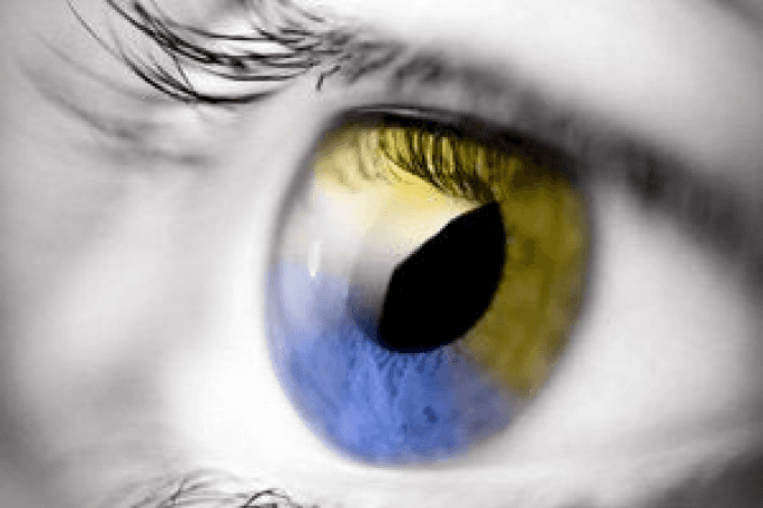
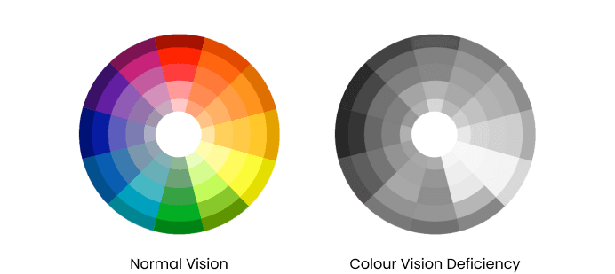
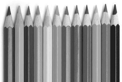
Colour Blindness
Colour Blindness
Colour blind peopel may also have trouble telling the difference between certain colors or shades.
Some very rare forms of color blindness make a person unable to see any colors.
For most colour blind people their condition is genetic, usually inherited from their mother, although some people become colour blind as a result of other diseases.
Problems can arise across the entire colour spectrum potentially affecting perception of all reds, greens, oranges, browns, purples, pinks and greys. Even black can be confused as dark red, dark green or dark blue/purple.
Types Of Deficiencies
Types Of Deficiencies
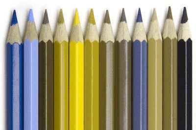
Blue- green colour deficiency: Tritanopia: When one has no S cones. They can’t perceive blue light. They see mostly reds, light blues, pinks and lavender.
Red- green colour deficiency:
Protanopia: The L cones are missing. One can’t perceive red light. One mostly sees colors as shades of blue or gold. May easily confuse different shades of red with black.
Deuteranopia: The M cones are missing. One can’t perceive green light. One mostly sees blues and golds. May confuse some shades of red with some shades of green. May also confuse yellows with bright shades of green.
Monochromacy: Only one type of cone is present, or no cone is functional at all. The person has very limited or no ability to see color. Instead, the person sees the world in varying shades of gray.
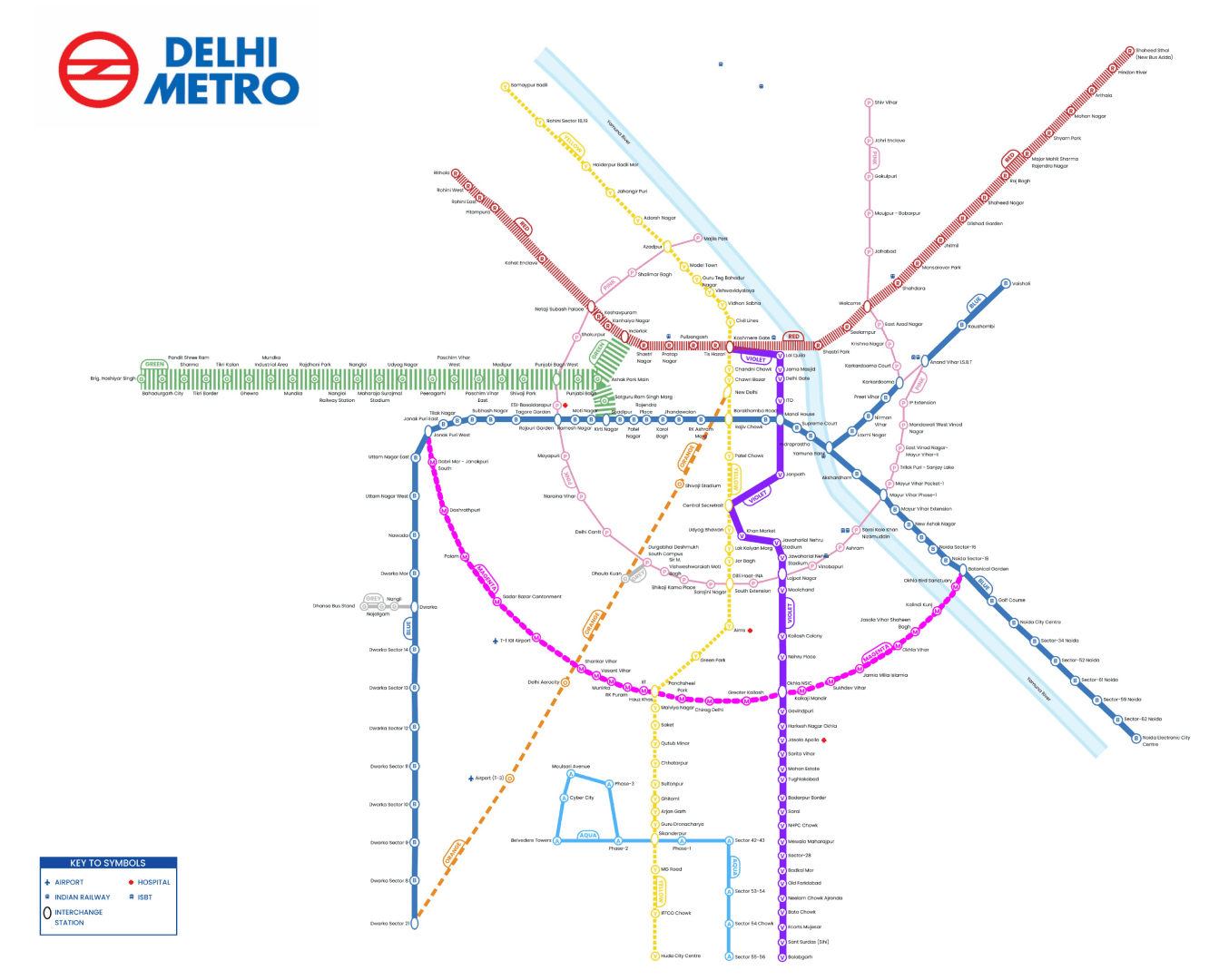
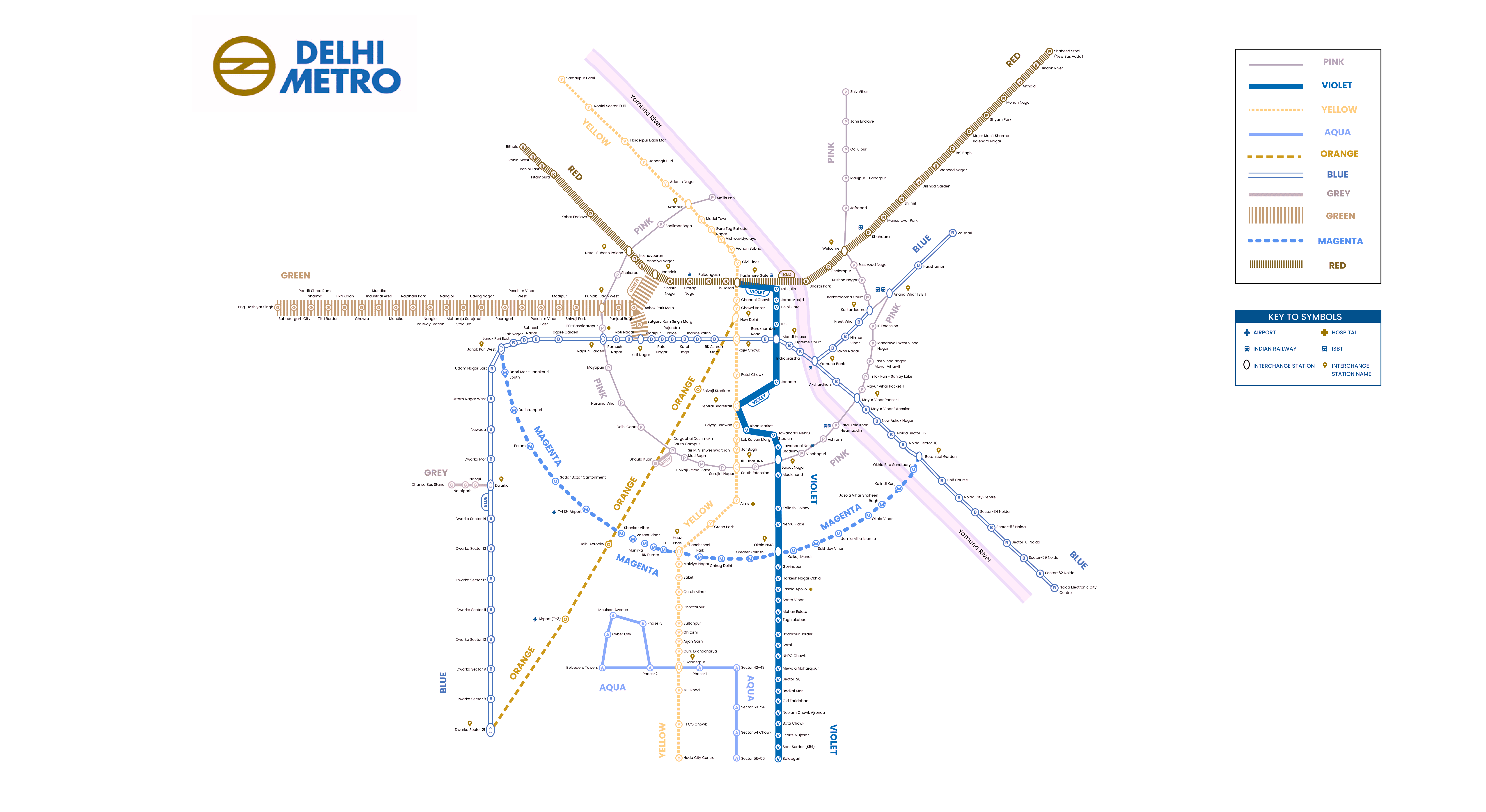
Current Delhi Metro Map
Current Delhi Metro Map
The Current Map of Delhi Metro has 10 Colour coded intersecting lines at various angles, and station names written along them.
The Current Map of Delhi Metro has 10 Colour coded intersecting lines at various angles, and station names written along them.
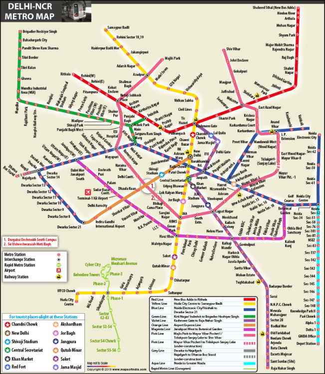
Problems with current map
Problems with current map
Lines are easily confused by a colour blind -person as the thickness and shape is same
Lines are not parallel and are intersecting at odd angles
Proper marking for interchange stations is absent
Information is cramped closely
Lines are easily confused by a colour blind -person as the thickness and shape is same
Lines are not parallel and are intersecting at odd angles
Proper marking for interchange stations is absent
Information is cramped closely
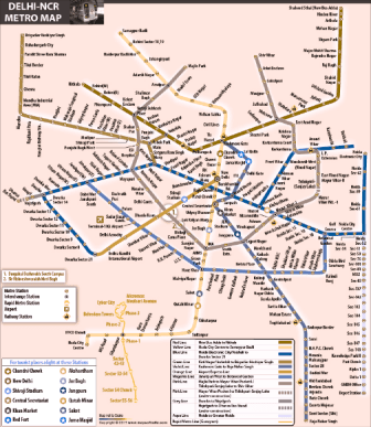
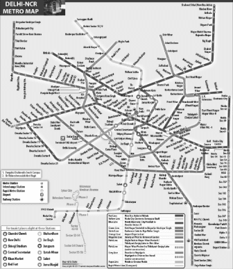
Stimulated Images
Stimulated Images
Map as it appears to those with Colour-blindness
Map as it appears to those with Colour-blindness

Solution
Solution
The new map tries to tackle all the pain points identified above and has additional features to make the map more accessible.
The new map tries to tackle all the pain points identified above and has additional features to make the map more accessible.

Different line shapes for each colour line to make it easy to differentiate even if the viewer is seeing the map in black and white.
Different line shapes for each colour line to make it easy to differentiate even if the viewer is seeing the map in black and white.

Marking on each station to recognize the line name on which the station falls.
For example, R on each station that falls on the red line.
Marking on each station to recognize the line name on which the station falls.
For example, R on each station that falls on the red line.

Line name marking at intervals on each line so that the viewer doesn’t have to refer any color key or remember the line shape for a color
Line name marking at intervals on each line so that the viewer doesn’t have to refer any color key or remember the line shape for a color

Marking for Interchange of stations to recognize intersecting lines easily
Marking for Interchange of stations to recognize intersecting lines easily

Key to symbols of important stations like Hospital, Bus stops, Airport and Railway stations
Key to symbols of important stations like Hospital, Bus stops, Airport and Railway stations
Parallel lines throughout the map design to reduce cognitive load while viewing
Parallel lines throughout the map design to reduce cognitive load while viewing
First Iteration
First Iteration
This map is fully comprehensible and all lines and markings are clearly differentiable even to a person who doesn’t see any colour at all.
This map is fully comprehensible and all lines and markings are clearly differentiable even to a person who doesn’t see any colour at all.
Let's test with people
Printed the map in monochrome version, and approached random people in Delhi Metro for feedback
Printed the map in monochrome version, and approached random people in Delhi Metro for feedback
Looks like we can improve
Looks like we can improve
Okay, so let's change for better usability, based on the feedback we received
Okay, so let's change for better usability, based on the feedback we received

Bolder and Bigger Line Names

Marking for Interchange Stations, more prominent, and marking on station names

Changed similar line shapes, to avoid confusion
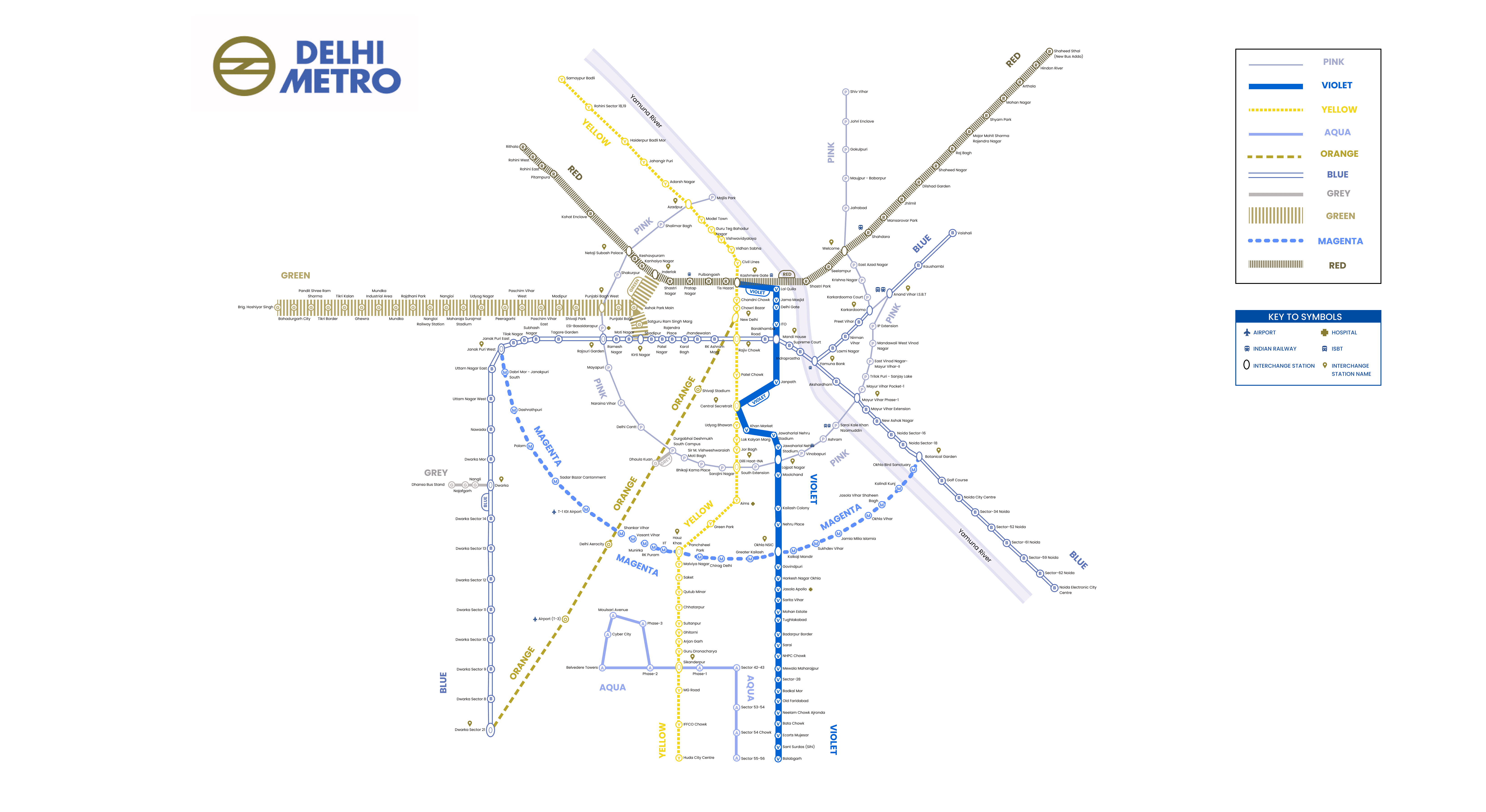
Final Redesign
Final Redesign
Incorporated the changes, and made it tang, tadang!
Incorporated the changes, and made it tang, tadang!
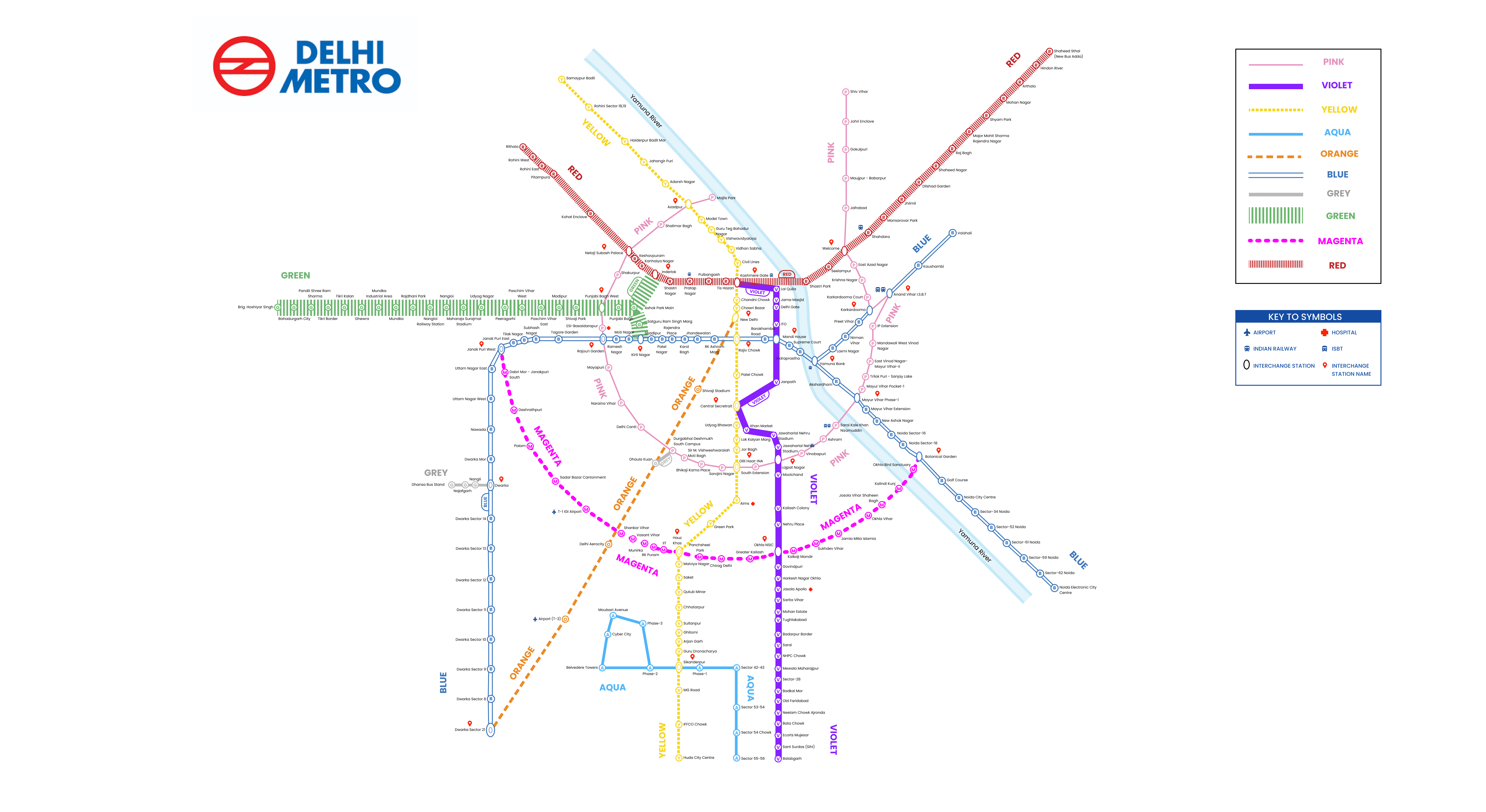
Full Colour Version
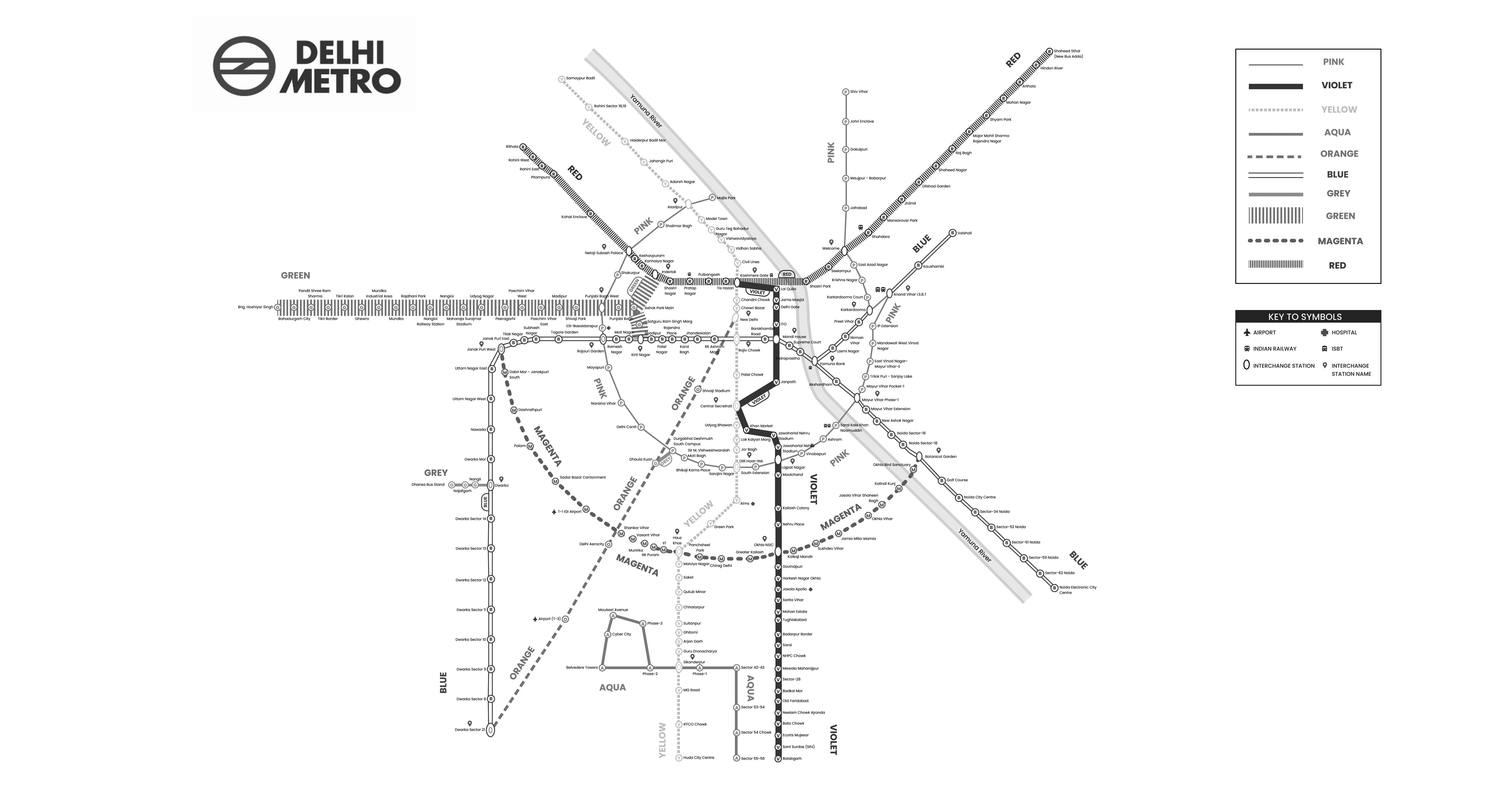
Monochrome Version
Stimulated Images
Stimulated Images
Of the Map as they appear to those with Colour-blindness
Of the Map as they appear to those with Colour-blindness
Red- Green Colour Deficiency
Blue- Green Colour Deficiency
Testing, Tusting once more
Testing, Tusting once more
Let's see the map in action, here's the final map!
Let's see the map in action, here's the final map!
"For those who could see, but not experience, this is for you"
Riddhima
India